Introduction
Rustic wedding invitations can feel warm, laid-back, and full of charm. But it’s easy for them to tip into something overdone if you try to fit in too much. The key is keeping them stylish without letting them feel crammed. That balance is where rustic starts to feel chic.
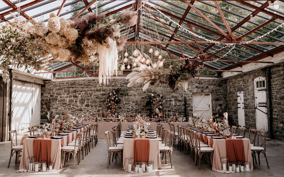
As we move into early autumn in the UK, natural shades and cosy textures come alive in wedding planning. It’s a perfect time for rustic designs - with rich colours and relaxed style - but plenty of brides and grooms worry that rustic will end up looking cluttered or too “handmade.” It doesn’t have to. With some simple, thoughtful choices, rustic invites can stay neat and elegant from the first look right through to the RSVP card.
Finding the Balance Between Warmth and Simplicity
Rustic doesn’t mean unfinished. It just leans into texture, natural colours, and softer styling. But it still needs space to breathe. Too much texture or too many “farmhouse” add-ons, and suddenly your invites feel busy instead of lovely.
The right combination starts with tone. Choose a warm palette - maybe soft earthy tones, faded greens, or muted golds - that feels like early autumn without being full-on woodland. A limited colour set gives your design a calm look, especially when mixed with a simple layout. Try not to overload your invite with layers of background prints or patterned borders. These things can fight for attention and make text harder to read.
Texture can come through in ways that aren’t loud. A rough edge here or a ribbon tie there. But try to pick one or two features and let the rest stay simple. Neat, spaced-out layouts and clean fonts can work as a backdrop that supports a rustic feel, rather than fights against it. That kind of simplicity makes your warm details shine.
The Invite Shack offers rustic wedding invitations with customisable colour palettes and fonts, so every couple can strike their ideal balance between warmth and simplicity.
Choosing Decorative Elements with Intention
Less really is more when it comes to decoration. It’s tempting to add every idea you’ve saved - pressed flowers, twine, vintage tags - but most designs look better when just one or two accents lead the way.
Start by picking a detail that ties into the rest of your wedding. Maybe that’s a small item like a wax seal, a sprig of dried lavender, or a bit of twine in your wedding colours. One smart feature adds character without taking up space. If you’re unsure, a hand-drawn leaf or nature-inspired sketch can be a subtle nod to the season without crowding the corners.
Font choice makes a huge difference, too. A rustic font doesn’t mean it needs to look old or scratchy. One with soft curves or a light texture can create a homespun feeling, without being hard to read. Keep it clean by using one or two font styles across your design rather than switching with every line.
Avoid decorative extras that make everything fight to be seen. Multiple fancy frames, repeating borders, or lots of mixed graphics can end up cancelling each other out. Stick to just enough to capture the feeling without overloading the page.
Coordinating the Look Across Your Invite Set
Your full invite suite usually includes a few parts. The main invite, an RSVP card, maybe a details card or gift list guide. If each piece looks and feels slightly different, the full set can quickly become a mismatch.
One of the easiest fixes is repeating a design element. If your invite has a sprig of greenery at the top, repeat it in a corner of the RSVP. If you’ve used a soft tan background for your main card, mirror that shade on your info sheet. These repeated details pull the whole package together.
It also helps to stick with one layout style. For example, if your names are centred and the text is clean and minimal, follow the same structure across the set. That way, no single piece feels too heavy, and the collection feels like one steady voice.
A coordinated suite doesn't need to be complicated. In fact, it’s usually simpler. A soft touch repeated well is stronger than five different loud ones. It creates rhythm and makes your invite feel calm and well thought through.
The Invite Shack can include matching RSVP cards and details cards in the same rustic style, helping you keep your stationery set visually connected and consistent.
Making Room for Practical Details Without Overfilling
Sometimes space slips away fast. Dates, times, dress codes, menu options, directions - all of it feels necessary, but not all of it works when crammed into one small rectangle, so it depends which format of invitation you choose. Gatefolds and concertina are perfect for holding alot of information.
Rather than shrinking everything down, break the information into parts. A small details card is often better than squeezing extra lines into the invite. Give each section some breathing space so your guests can read without squinting or confusion.
When adding practical info, be choosy with layout. Keep your lines clear and short. Try using bullet points when you can. Avoid centred, broken-up sentences that stretch across the page. Simple, left-aligned info reads quicker and gives a tidy feel.
Resist the urge to squeeze in extras like quotes, extra graphics, or long-winded intros right next to your ceremony time or directions. The more you add, the less effective it all becomes. Focus on the must-reads, and tuck away the rest elsewhere, like on your website or an extra enclosure.
Letting Your Venue and Season Do Some of the Work
Your setting can add character without needing to over-style your invites. If you’re getting married at a barn in Kent or a country garden, these locations already carry some charm. Let that come through in your designs.
For an early autumn wedding in the UK, you’ve got natural tones like moss, gold, rust, and plum already built into the landscape. This is a chance to mirror those shades without copying every twig or tree. Maybe it’s a warm, dusky pink ribbon. Maybe it’s an envelope in a muted copper tone.
You can even refer to the venue lightly in the invite wording itself, using names or descriptions that hint at the setting. It’s a soft way of anchoring the design without needing more graphics or illustrations. It avoids clutter while still tying your invite design to the surrounding space and time of year.
Sometimes the best rustic look comes from knowing when to stop. Your theme shouldn't carry every job. The season and space will do half that work for you.
Keep It Calm, Keep It Clear
Rustic doesn’t mean messy. In fact, rustic styles work best when they leave a little space around every detail. That space is what lets each flower print, craft tie or warm tone shine. Style gets lost when you try to say everything at once.
When we keep things focused - just a few colours, fonts, accents - we don’t lose the charm. We give it a bit more weight. Well-set rustic wedding invitations can lead the way in setting your day’s entire mood. If they feel calm and composed, so does everything that follows.
When you're after a look that feels relaxed but still pulled-together, our approach to rustic wedding invitations keeps things calm, clean and full of character. At The Invite Shack, we focus on the details that matter so your style stays clear from the first envelope to the final RSVP.